I seem to have conveniently forgotten my own freezer paper stencil-along timeline. The goal of a "decent stencil in a month" has fallen by the wayside, as I digress on assorted experiments.
This week I have been
The downside of flattening an image to Black & White
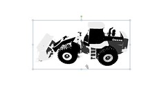
Last week I used a very quick and dirty method in Microsoft Word for flattening an image down to two colours (Format picture > Recolor > Black and white). It was simple and works well with simple, high contrast images, but I found that I lost a great deal of detail in the picture of the tractor that I was using.
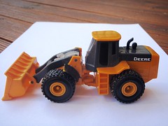
To demonstrate, here is a before and after showing what happens when I flatten this digger ....
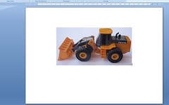

It becomes sort of a black blob with a scoop. Depending who you are creating the stencil for, this might be perfectly fine. For example, I'm sure my Argy would still see a John Deere digger clearly in this image!
Using brightness and contrast
A better way to go, is to adjust the image using the Brightness (adding more white or black) and Contrast (changing the difference between lightest and darkest areas) features.
So first I increased the Contrast ... right up to 100%. You can see that this reduces the image to just three colours - red, yellow and black. This is perfect as this week I am trying out a multi-colour stencil.
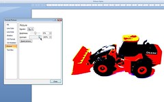
Next I played with the Brightness levels. Someone may be able to help here, but I found this to be a very inexact science. I simply adjusted it by eye. If the brightness is increased too much, I found a lot of the image disappeared (see below).
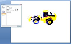
Likewise when the brightness was too low, a lot of detail was lost (and below again).
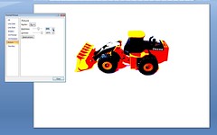
I thought that I what finally came up with (below) probably gave a suitable level of definition to the stencil. (An increase in brightness of about 40%).
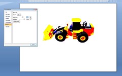
Applying further image effects in Microsoft Word
And now a quick piece of advice, based on experience. Even though you are making visible changes to the image, every detail about the underlying graphic remains intact. (You may notice in your travels that there is a Reset picture option you can select). Microsoft Word applies many of its image editing features to the underlying graphic and not to alterations you have made. For example: after altering the brightness and contrast, I thought I'd change the image from colour to grey scale. Whoosh! All my work gone. Grey scale was applied to the original photo.
To get around this you can do a little hack workaround like this. Copy the altered image from Microsoft Word into something simple like the Paint accessory that comes with Windows. Then copy it again and paste it back into Microsoft Word. Et voila! You can now continue making changes, like I have done below.
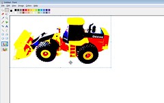
From here ...
Sometime after the weekend I hope to have a finished stencil to show you. I am going to be using this digger and trying out a number of colours. Argy is going to love it (he's my least critical audience). Rather than the Speedball screen printing ink that I have been using I've purchased some acrylic paint and textile medium to mix up.
During the week I read some instructions about creating a multiple colour freezer paper stencil. They said that you should only place the different colours adjacent to each other. Never over one another. Shhhh, don't tell anyone .... guess what I'm going to try and do ....
Be sure to look at the sidebar for the latest on other stencil-alongers. There's been some great stuff happening.




Thanks for the extra tips. I've been to the oppy to get an old tee to practice on so now I'm all set to have a go. Thanks so much for sending me some freezer paper. I'm so slack sometimes....
ReplyDeleteGosh, you are getting all hardcore now!! Go you!
ReplyDeleteI better choose something and hurry up if I want to get in on this by the time our month is out. EEK!
Wow, you are really getting ambitious here, and it's fantastic! Thanks for the tutorial, which is very clear.
ReplyDeleteMy first attempt at two-part stenciling (the tightrope-walking lady) did have a few problems where I tried to cover one colour with another (it turned out that the white shows through the dark blue on her shoes), but I was expecting stencils to be somewhat rough anyway, so it didn't really matter to me. And I stitched beads over it!
Can't wait to see what you try next.
You are definitely hardcore!! Look forward to seeing the end result!
ReplyDeleteI am loving the limit pushing. I can't wait to see what you come up with. I am storing all the info for when I have time to give it a go, it looks like great fun.
ReplyDeleteWow, you really did grab a ton of detail. I'll be linking to this.
ReplyDeleteThat really looks great. And what a helpful tutorial! You've done all the hard work for me. Thanks!
ReplyDeleteBlimey! You've taken it to a whole new level. I'm impressed.
ReplyDelete